
What is required to beat Bing’s mobile-friendliness test?
Although Google has given webmasters the opportunity to check if their sites are mobile-friendly or not based on its predetermined parameters, Bing has been lagging behind a little in this respect. This is in spite of the fact that it followed Google in adding a mobile-friendly ranking signal to its engine in order to give optimised sites a better chance against those which do not cater to smartphone users. This is why earlier in the year many businesses sought website design in Bristol to make sure their sites were able to cut the mustard in this mobile-oriented world.
However, this week Microsoft finally endowed Bing with its own tool to test the mobile-friendliness of websites. So what are the factors that it takes into account and what will sites need to do to get a passing grade?
User-Friendliness
Perhaps unsurprisingly the Bing mobile-friendliness test tool is mostly designed to highlight what sites are doing right or wrong in terms of usability, since catering to mobile users requires a different approach to those involved in desktop design dominance.
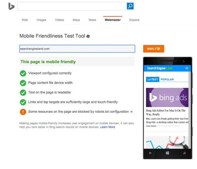
Firstly the tool tests whether or not the interactive elements on the page, whether that might be embedded links, interface items or other points of engagement, are large enough to operate effectively on touchscreen devices. This is important because touchscreen interactivity is less precise than the inputs that can be achieved on a PC or laptop using a mouse cursor, so mobile users need to be able to have tap targets that are designed for fingers and thumbs.
Secondly the tool checks to see if any text which is visible on the page is visible and easy to read. Companies like Aardvark Creative will be able to help businesses make adjustments to sites which do not live up to expectations in this respect.
Technical Considerations
The other parts of the mobile-friendliness test tool that Microsoft has built for Bing will look to see if the content on the page is responsively adjustable and able to match the width and resolution of any handset’s display without going over the edge. Sites must also not place restrictions on zoom control and ensure that viewport settings are correctly configured to get full marks.
The mobile-friendliness of any URL can be checked using the new Bing test and no doubt webmasters will be keen to comply with its suggestions.